Magazine spread featuring a large headline about Paula Scher, with text discussing her career as a graphic designer and her achievements, including the cover story and a black-and-white photo of her in the bottom left corner.
Photograph of a two-page magazine article. The left page features large, bold, vertical black text on a white background. The right page contains another column of text with a highlighted yellow section and a small caption at the bottom.

DOUBLE PAGE SPREAD + ADAPTIVE DESIGN


Paula Scher

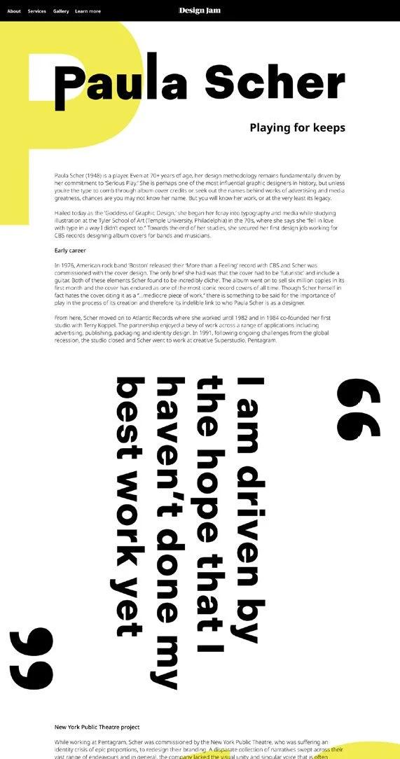
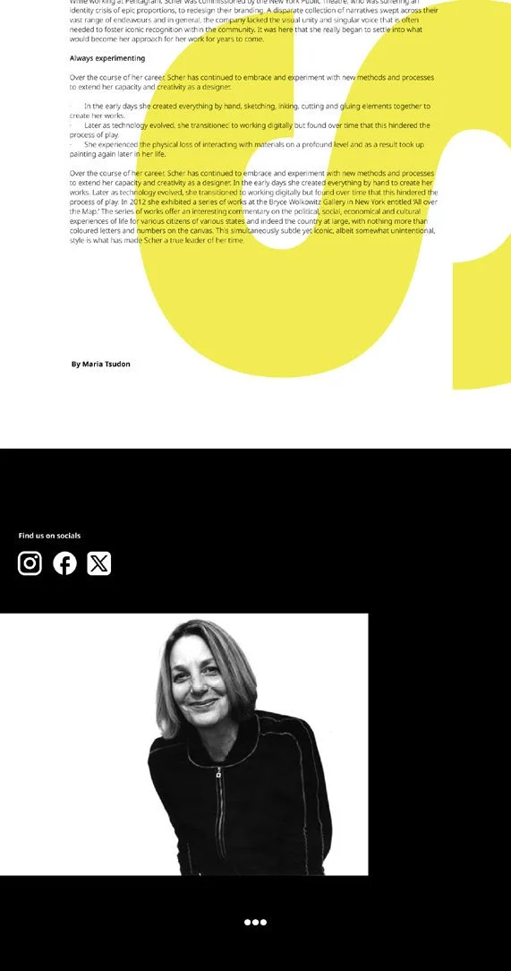
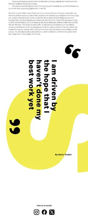
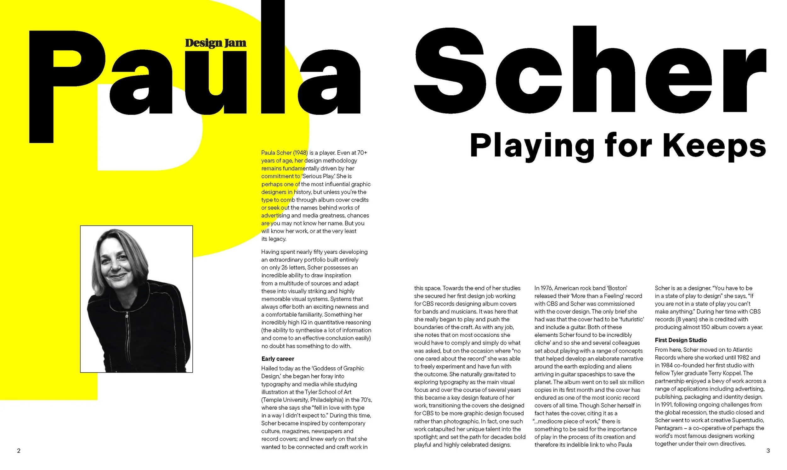
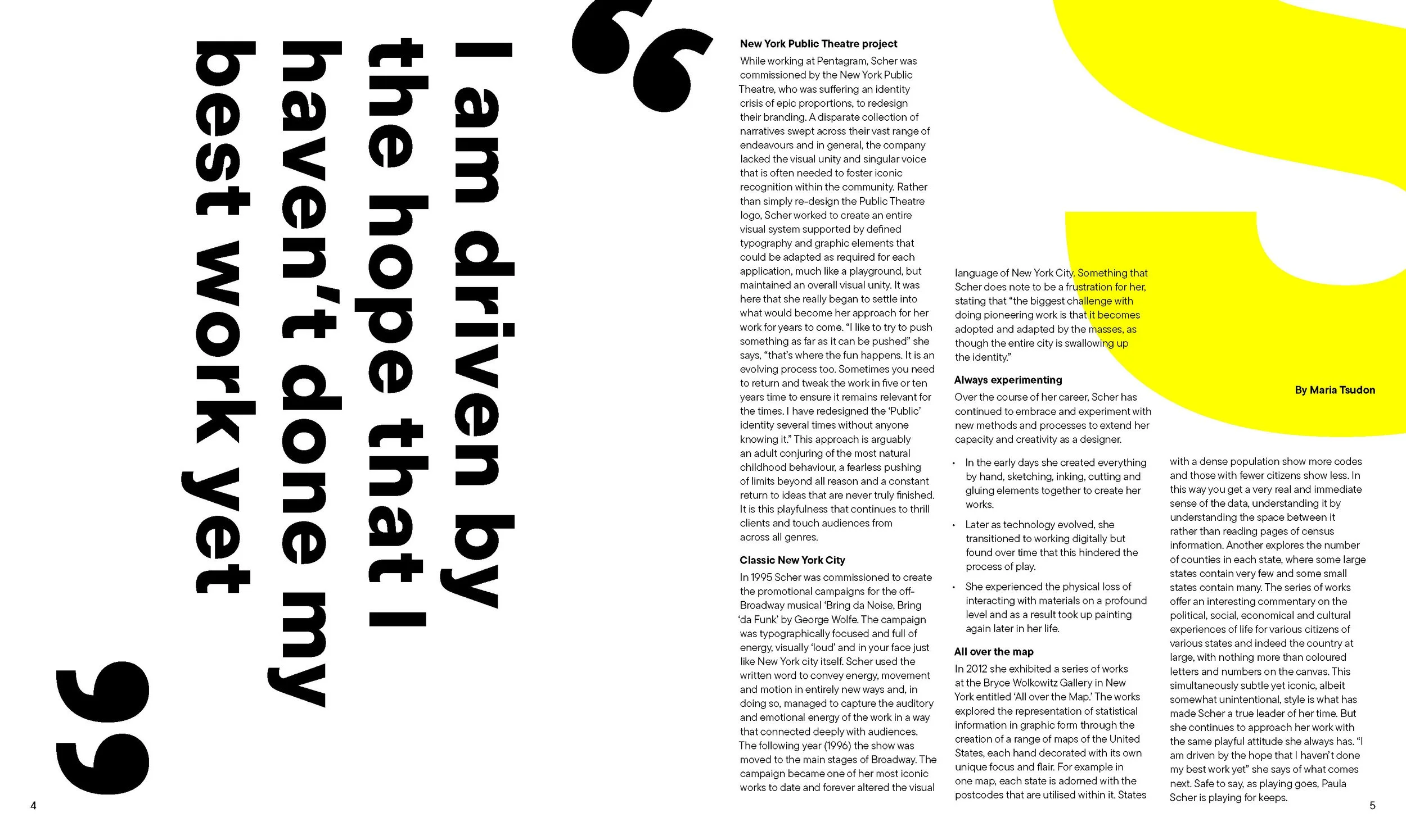
This project focused on designing a series of editorial double page spreads based on Paula Scher, with typography as the main design driver. The layout, type system, and visual elements were all developed by me, with a strong focus on hierarchy and readability across the spreads. A big part of the process was refining the body copy — selecting an appropriate typeface, testing font weights and sizes, and adjusting kerning, leading, and spacing to improve flow and readability. I also considered factors like x-height and how the type performed at different scales, ultimately moving to a left-aligned format to create a more natural reading experience. The final layout draws from Scher’s work, using large scale letterforms, pull quotes, and graphic elements to create movement and structure across the pages.

DOUBLE PAGE SPREAD


Page from a magazine or brochure featuring a graphic design article about Paula Scher, with a large yellow graphic element, bold black title, and a black-and-white portrait of Paula Scher.
An article with large vertical black text on a white background on the left side. To the right, there is a block of text discussing New York Public Theatre project, designed by Scheer, with a yellow abstract shape and highlighted yellow text for emphasis. The highlighted text mentions "the challenge at the challenge" and "it becomes". The article is by Maria Tsudon.

ADAPTIVE DESIGN


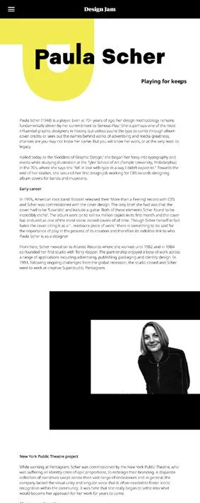
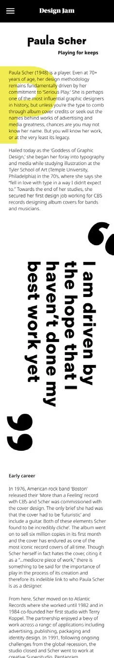
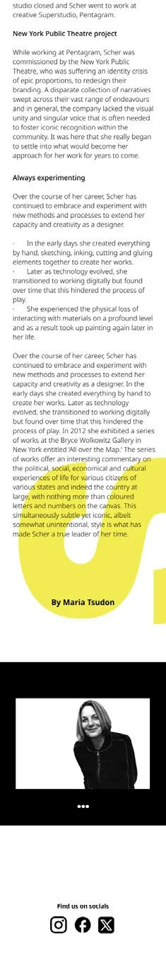
Building on the print layouts, the project was extended into an adaptive design outcome across iPhone, tablet, and desktop formats. Each version was designed specifically for its screen size, requiring adjustments to scale, spacing, and composition while maintaining a consistent visual system. The focus was on translating the typographic hierarchy and overall layout into digital formats without losing readability or structure, ensuring the design remained cohesive and functional across all three platforms.

iphone

A webpage displaying the profile of designer Paula Scher, born in 1948, highlighting her influence in graphic design, her education, and career achievements, including her work on album covers for CBS and musicians. The page includes a quote about her impact, with sections in bold and highlighted text for emphasis.
A screenshot of an article titled 'New York Public Theatre project' about Scher' work and influence in the arts, with a highlighted quote in yellow and a black-and-white photo of a woman at the bottom, along with social media icons.

Tablet

Desktop

A webpage titled 'Design Jam' featuring a biography of Paula Scher, with a quote in large black text saying, 'I am driven by the hope that I haven't done my best work yet,' against a background with a large yellow circle.
The image features a webpage with a highlighted text section, social media icons, and a black-and-white photo of a smiling woman with shoulder-length hair, wearing a black jacket, at the bottom.
A quote on a yellow and white background reads: "I am driven by the hope that I have that I don't my best work yet." The quote is attributed to Maria Tsudon and is accompanied by social media icons at the bottom.
Profile of Paula Scher, a graphic designer, with text about her career and achievements, including her early work, education, and notable projects. Contains a black and white photo of Paula Scher.